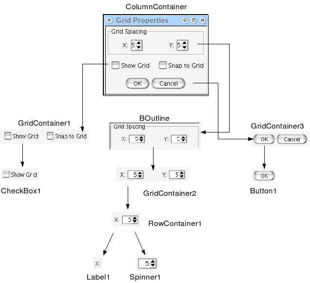
In order to illustrate how an interface is built using Balise, we will build a classical "Grid properties" dialog, such as the one that can be found that sets the Explicit Container Grid properties. This dialog is shown in figure Figure 1. This diagram also shows all the widget containers and the widgets this dialog consists of. The root level of the dialog content is a column container. Here are the different items that are contained within this column container, from top to bottom:
An outline that encloses a grid, which itself contains in each of its two cells a set of one label and one spinner to set the horizontal and vertical grid spacings.
A grid also made of two cells, one cell for the Show Grid check box and one cell for the Snap to Grid check box.
The usual and buttons.
Launch Balise using the command given in the installation section. You should see two windows, the widget palette and the clipboard.
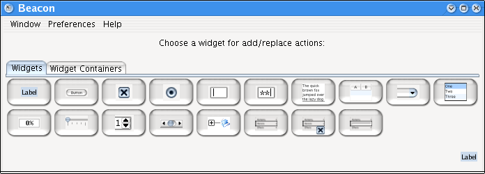
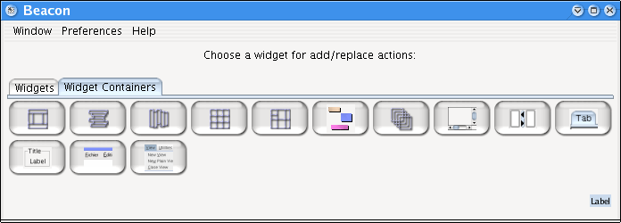
The widget palette mainly consists in a tabbed pane that show two tabs, a widget tab and a widget container tabs. The content of these two tabs is shown in figure Figure 2 and Figure 3. Select one of these buttons to determine the type of the next widget that you will add in your interface. The currently selected widget is shown in the bottom right corner of the widget palette. There is only one instance of this window, whatever the number of window widgets currently being edited. For this reason, the widget palette can also be seen as Balise main window. New windows are loaded or created using the widget palette menu. Using this menu, you can choose to create a new window (or dialog) or load an XML definition of a WindowWidget. If the widget described in the XML file is not a window, Balise will create a window and set the widget as its content (or menu bar if the loaded widget happens to be a BMenuBar).
The clipboard holds the items you copied or drag'n'dropped into it (which amounts to the same). There is much to say about the clipboard, which also acts as a provider for standard or favorite widgets: be sure to read the section about the clipboard.
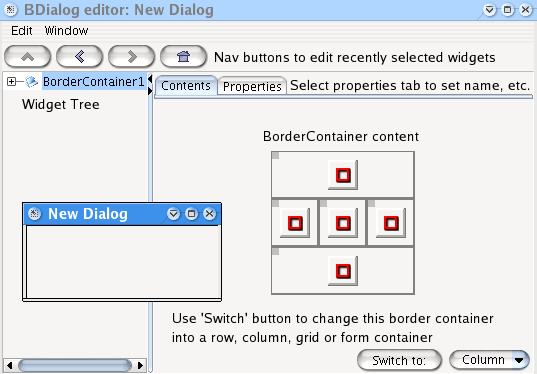
The first thing to do is to create a new dialog using the command from the menu of the widget palette. An empty dialog appears, along with an editor window. Both should look as shown in figure Figure 4. The widget and widget container hierarchical structure is mirrored in the widget tree on the left side of the editor window. Selecting a widget in this tree also selects this widget for editing purposes. The browser-like navigation button at the top of the window allows to recall recently edited widgets (left and right arrows), edit the parent widget container of the currently selected widget (up) or go straight to the content widget (home). Most of the edition process takes place at the left (or more appropriately center) part of the editor window which consists of a tabbed pane.
By default, a newly created window displays a border container as content (this is a fairly common situation). Balise always assumes that a window is not empty : you cannot delete the content widget. You may switch it to another widget container type, paste a widget in place of the content widget, embed the content widget in another widget container, etc., but you cannot delete the content widget. Given all the possibilities you have to modify the content widget, this was not deemed necessary. The contents of the default border container are shown in the Contents tab. A set of buttons or thumbnails depicts the current state of the border container. Whenever a position (CENTER, NORTH, etc.) is occupied by a widget, the button turns green. More about these buttons later : for the time being, the content widget should be a column container, not a border container. Select Column in the combo box at the bottom right of the content tab, and click on the switch button. Watch the widget tree: it should now state ColumnContainer1 as being the content widget. The Contents tab now shows only one button.
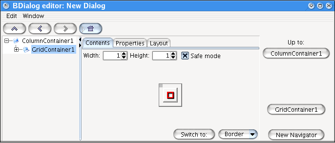
It's high time we start to fill the content widget. The top widget is a BOutline, but we will skip it for educational purposes (let's pretend we forgot about that one). What we need is then a grid container. Select the Widget Containers tab in the widget palette and then select the button. Next, click on the red button in the Contents tab of the editor window. A grid container widget should now be attached to the column container in the widget tree, and the editor window should look as the window shown in figure Figure 5.
You should notice a newcomer in the right part of the editor window: a set of navigation buttons has appeared. These buttons allow to quickly select (and edit) any other child of the column container widget (the grid container parent widget). The 'up' button here labeled ColumnContainer1 also allows to edit the column container itself. The button labeled allows to get a copy of this set of buttons in a standalone windows. If you have a major or often used widget container in your GUI component, you can ask for a detached navigator and then easily recall any child of this widget container (or the widget container itself). Last but not least, another way of selecting a widget is simply to click on it in the edited window. A black frame will outline the widget to show it has been selected. If you click several times in a row (within 0.7s to be precise -no need to hurry !-), say n times, the nth-1 parent widget container of the clicked widget will be selected instead of the widget itself. This way, parent widgets can be selected even if they do not provide a 'clickable' space because their children take up all the available space.
The grid container editor Contents tab shows more items than the border container editor did. The width and the height of the grid container can be set using the two relevant spinners. A check box allows to resize the grid in a 'safe' mode, where any downsizing that will cause the loss of at least one widget will trigger user confirmation through a dialog. Another feature concerning grid shrinking is that 'lost' widget will be retained as much as possible in the new layout. For example, suppose a 3x3 grid has a child at (3,3), and it's shrunk to (2x2). If the (2,2) position is unoccupied, the widget at (3,3) will be sent to (2,2) prior to shrinking. The user has to manually delete this widget if he does not need it anymore. If there is no way the (3,3) widget can be kept it is simply discarded (safe mode disabled) or the user is asked to confirm deletion (safe mode enabled).
The grid container navigator (the set of buttons on the right) identifies the grid children using numbers instead of widget names. This is because using names for a grid layout can use more space than reasonable for a navigator. Numbers make shorter buttons, although they make child widget anonymous.
Back to the tutorial : we need two horizontal cells (one row, two columns), so set the width to two. Each of the cell will be occupied by a row container, so choose the RowContainer button in the widget palette and click on the first red button of the grid container editor. The row container editor looks a lot like the column container editor, so there is nothing more to point out.
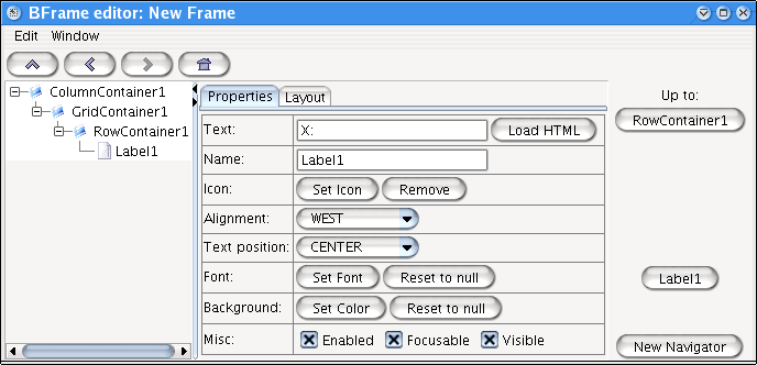
We now have to add a label and a spinner to the row container. Get back to the widget palette and select the BLabel button. Click on the red button of the row container editor. The editor window should now look like figure Figure 6. This time, no Contents tab is seen in the tabbed pane: a label is a Widget, not a WidgetContainer, and has no content (child widgets). The Properties tab allow to set the properties of the label, more or less from the most useful to the most seldom used ones. The most important property, of course, is the text of the label. Enter X: in the text field. You don't need to modify the name of the widget because you won't need to access the label (as a variable) at run time. Otherwise, it is a good idea to give a widget a more meaningful name than just 'Label1'.
Get to the parent row container, either using the up arrow in the browser-like set of nav buttons at the top of the editor window, the RowContainer1 button of the navigator at the right or pressing the up arrow key. You should now see that the Contents tab shows two buttons instead of one : one green and one red. The green button identifies the label that has been added. The red button identifies an empty position where widget addition takes place. The row container editor, the column container editor and some other like explicit container editor show a "trailing" empty button where widgets may be added.
Select the BSpinner button in the widget palette and add a spinner through clicking the empty button. The spinner editor window a bit complex because a spinner may use integer values, double values, a list of predefined values, or dates. The default integer spinner is exactly what we need : we just have to set a minimum value of 1 (a zero grid spacing means trouble!) and a maximum value of, say, 1,000. The current value can reasonably be set to 5 (the program will probably set this value to the real value after loading the GUI, anyway). Tip: the spinner might calculate its width from its initial value. A value of 5 means that the spinner might be quite narrow and display only one figure (5). A trick is to use a 2 or 3 figure initial value (like 100) to force the spinner show 2 or 3 figures and have the program set the correct value after loading and packing the interface. This time, it's best to give the spinner a meaningful name like xSpinner or XSpinner.
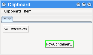
Let's get back to the GridContainer. Instead of going through the process of creating another row container with its label and spinner, we will simply copy the row container and paste it in the second cell. Select the first green button not by clicking on the button but on the frame around the button. The frame should now be outlined in light purple as shown in figure Figure 7. Copy the button using from the menu (or its Ctrl-C shortcut), or drag the button using the blue square and drop it onto the clipboard, using the Ctrl key to avoid deleting the widget as it is copied. The edit menu shortcuts also work in the edited window. A new item should appear in the clipboard, as shown in figure Figure 8 (actual widget location may vary). The green frame around the copied widget means that it is selected and that it is a non persitent item. Non-persistent item are discarded when Balise quits. Persistent items are displayed with an italic face and show a red frame when selected. They are kept between different Balise sessions. If there is a particular widget you often use (like the OK and Cancel buttons provided in the buttons tab), copy it to the clipboard and make it persistent. New tabs can be added to the clipboard for widget identification.
Now select the second red button of the grid container and paste the copied widget, or alternatively drag it from the clipboard onto the red button. If you use plain drag and drop, the widget will be deleted from the clipboard. As before, hold down the Ctrl key if you want to prevent the widget from being deleted (this is not useful here since it is unlikely that the row container will be reused). Edit the newly created label and spinner and set the label text to Y: and the spinner name to YSpinner. The edited window should now look as figure Figure 9.
Get back to the main column container, select the GridContainer widget container in the widget palette and add a grid container at the bottom of the column container (bottom red button). Make this new grid 2 cells wide and add a BCheckBox in each of the cell. If you want to add several widgets in a row whithout automatically selecting them as they are created, hold down the Ctrl key while selecting a red button. Set the text of the first checkbox to Show Grid and the text of the second checkbox to Snap to Grid. Name the two checkboxes as you wish, e.g. ShowGridCB and SnapCB. The resulting window is shown in figure Figure 10.
The next step consists in adding the and buttons. For illustration purposes, we will suppose that you used the sample folder supplied with Balise as Balise Files folder, in which case the clipboard definition contains a persistent GridContainer with these two buttons. Drag this grid container in the empty red button of the column container. Note that persitent clipboard items are not deleted after being dragged and dropped, whereas non-persitent items are deleted if the Ctrl key is not held down during the process. The names and texts as copied from the clipboard are just what we want, so there is no need to edit them. The edited window should look as shown in figure Figure 11.
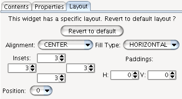
The basics of the grid properties dialog are there, but there is obviously a need for additional layout... First, the top grid should be outlined. Select the top grid, select the outline container in the widget palette and select the menu item in the menu of the editor window. The grid is now embedded in an outline container. Select the Properties tab of the outline container editor, which is fairly complex due to the many possibilities offered by Swing in terms of borders. For the time being, select a Title border and enter Grid Spacing as title text. It is also a good idea to specify a different layout for the outline widget than the column container default layout. Go to the Layout tab. Since the outline container layout corresponds to its parent default layout, the layout parameters widgets are disabled. Select the button : a layout is created and the parameters widgets are now enabled. Keep a CENTER layout, select an HORIZONTAL fill and enter (3, 3, 3, 3) as layout insets, as shown in figure Figure 12. Similarly, select the grid container that contains the two checkboxes and create a new layout. Specify a CENTER layout with a NONE fill type. Finally, select the buttons row container and specify a CENTER layout, NONE fill type and (10, 0, 5, 0) insets ( 10 and 5 corresponds to top and bottom values).
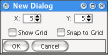
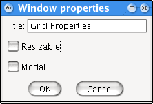
All there is now left to do is to specify a title for the dialog. Select the menu item from the menu of the editor window. Enter "Grid Properties" as window title and deselect the Resizable check box if you wish (see figure Figure 13). Please note that the modal setting is ignored at this time. You can test how the window behaves by selecting the menu item in the menu of the editor window. In this mode, widget selection is ignored. You can also have limited interaction with the edited window widgets in Edit mode if you keep the Ctrl key pressed while selecting a widget with the mouse. This feature is not equivalent to interacting with the edited window in run time mode, but it allows for example selection of a tabbed pane tab.
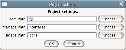
Though it's not mandatory, it's best to create interfaces within the context of a project. Projects are explained in detail later on. For now, let's just say a project is a directory structure that holds buoy interfaces files, images used in these interfaces and balise specific files. To associate a project to an interface, select the command from the menu. This command first asks to save a project file and then opens the project settings window as shown below. It is recommended that the files are organized the way the description of which follows (though it is perfectly possible to use another design). A root folder (say foo) contains three subfolders :
BaliseFilesImages(orIcons)Interfaces
The first folder will contain Balise specific file such as the project and interfaces files. It is recommended that project files use .bpr extension whereas interface files should use .bui extension.
The second folder will hold images used by widgets. These resources are external and are not stored in the interface definition files.
The third folder will contain buoy xml files which are updated each time a balise files to which a project is associated is exported. If you don't use a project when editing an interface file, then you must manually export the buoy file.
These folders are set in the Project Settings edit window :
The root path is the location of the foo folder relative to the BaliseFiles folder where the project is saved. The other two are straightforward.
The final stage is actually saving the balise file and use the buoy interface in your program. There are two ways you can do that :
save the content widget, declare a class that extends BDialog, load the content widget definition file in the constructor and set it as the dialog content.
save the whole dialog and load it anywhere in your source code.
If you choose the first option, check in the menu. If you choose the second option simply leave this option unchecked. It is also possible to prototype a single selected widget or widget container using the command. In this tutorial, we will assume you chose to save the whole window. Balise helps you write the code to load the window from its definition file : select the menu item from the menu of the editor window. The following prototype code is displayed. You can copy any part of it and incorporate it in your source code. Balise does not manage or modify any of your source code file (and probably never will, I don't like much prototyping). This prototyped text just saves typing when designing or modifying a GUI. It is possible to specify in each widget properties window if a widget should appear in the prototyped code.
InputStream inputStream = null;
try
{
    inputStream = new FileInputStream( new File("Interfaces/test.xml") );
    WidgetDecoder decoder = new WidgetDecoder( inputStream );
    BDialog window = (BDialog) decoder.getRootObject();
    ColumnContainer columnContainer1 = ((ColumnContainer) decoder.getObject("ColumnContainer1"));
    BOutline outline1 = ((BOutline) decoder.getObject("Outline1"));
    GridContainer gridContainer1 = ((GridContainer) decoder.getObject("GridContainer1"));
    RowContainer rowContainer1 = ((RowContainer) decoder.getObject("RowContainer1"));
    BLabel label1 = ((BLabel) decoder.getObject("Label1"));
    BSpinner xSpinner = ((BSpinner) decoder.getObject("XSpinner"));
    RowContainer rowContainer1 = ((RowContainer) decoder.getObject("RowContainer1"));
    BLabel label1 = ((BLabel) decoder.getObject("Label1"));
    BSpinner ySpinner = ((BSpinner) decoder.getObject("YSpinner"));
    GridContainer gridContainer1 = ((GridContainer) decoder.getObject("GridContainer1"));
    BCheckBox showGridCB = ((BCheckBox) decoder.getObject("ShowGridCB"));
    BCheckBox snapCB = ((BCheckBox) decoder.getObject("SnapCB"));
    RowContainer rowContainer3 = ((RowContainer) decoder.getObject("RowContainer3"));
    BButton okButton = ((BButton) decoder.getObject("okButton"));
    BButton cancelButton = ((BButton) decoder.getObject("cancelButton"));
    window.pack();
    window.setVisible( true );
}
catch(IOException ex)
{
    ex.printStackTrace();
}
finally
{
    try
    {
        if (inputStream != null)
            inputStream.close();
    }
    catch(IOException ex)
    {
        ex.printStackTrace();
    }
}